MUCH VAUNTED 'NEW SCANS' OF CODE PAGE
REVEAL MICRO WRITING...
Recently another blog announced that they had found high-resolution images of the Somerton Man Code page. They were apparently on an obscure blog page and amongst them was a 1200 DPI resolution image. Apart from the fact that the term DPI relates to the print resolution, They went on to claim that micro writing found on the original 400 DPI image would also have to appear on the 1200 DPI version that he found if it were real.
There are a number of issues with the 1200 DPI version but to show good faith, I examined one of the numerous copies that they had uploaded to one of the sites and it showed as having a resolution of 1200 DPI. Below are just some of the images, in fact from the 4th line, from the 1200 DPI code page. And as they had committed themselves, by default they had acknowledged the presence of micro-writing.
There are a number of issues with the 1200 DPI version but to show good faith, I examined one of the numerous copies that they had uploaded to one of the sites and it showed as having a resolution of 1200 DPI. Below are just some of the images, in fact from the 4th line, from the 1200 DPI code page. And as they had committed themselves, by default they had acknowledged the presence of micro-writing.
The micro writing is in the .4mm to .6mm range so well above the edge of perception that they cling to. For the record, the edge of perception is closer to .15 mm, there are people who have written at that size and maybe even still do. The writing implements used vary, from super sharp pencils to specially honed 'crow quill' pen nibs and even pinheads or sharpened matches. Tradecraft is all about making use of everyday items and to hide things, especially communications, in the less obvious places but nearly always in plain sight. On this blog, there are a number of posts on just how micro writing was done and then concealed.
The images shown here are from the raw file and have been taken from screen images with the exception of the final two images of the letter Q found near the base of this post, these were first printed out and then marked up.
The next step for some of these images and others I have is to work on enhancing their appearance without destroying their content. These will be published as and when they are completed.

This letter A is tightly packed with micro written code as you can see, it's a little blurred for which I apologise but it is the result of artificially inflating the DPI from 400 to 1200 which is generally regarded as not a wise thing to do. Nonetheless, it shows micro-writing.
And below is another, again from line 4:

And the 3rd letter A from line 4 which is not as clear the previous two but enough to show the presence of shall we say unusual markings with faint outlines of numbers:

The letter B below is really quite good given the nature of the scan:

This is the letter I from line 4, again a little blurred caused by the rescan effect:

Not a bad example, the lower halves of the two uprights in the letter M show the tightly packed micro writing as has been posted about on this blog for some years. In some cases, the writing is double stacked, notably wherever the letters of the 'code' are fatter.

The letter O was quite difficult to retrieve but once again you should just be able to make out numbers again tightly packed:

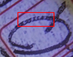
And now the famous letter Q . Sadly, the Q had been faded somehow, I wonder how that would have occurred? But, the good news is it can be recovered and even though faded you can make out the letters with numbers 22 or 23 alongside. To the upper left of the Q, there is quite a nice string of numbers although faded a little. Even in the tail of the letter, you will find examples of micro written code. You will need to look closely at this letter, perhaps reading glasses around 2.5 would be of value.
Raw Image
 |
| Raw Image from 1200 DPI 'new scan' |
 |
| Processed, contrast and curve |
 |
| Raw, marked-up image from 'new scan' |
For the sake of balance, here is the same Q, raw image, but from the original version of the code page, it was 400 DPI. The method used was to print the image out at high quality, 600 DPI and then took images in daylight u16-megapixel camera with a macro setting for close up work. For the record I took the 'new scan' image, 'Raw marked-up' immediately above in exactly the same fashion:

THE DPI MYTH
The reality is that DPI is not a measure of the quality of an image, it means 'DOTS PER INCH', dots of ink per inch delivered to the paper. Some have DPI confused with PPI which is Pixels Per Inch, a better indicator of quality. As you can see above the images taken from the 'new scan' at 1200 DPI is probably not quite as good as the immediately above, which came from the original, unaltered, 400 DPI image from the Advertiser newspaper.
All that's been done here is that I have taken the image above and the marked NP image in sunlight and at an oblique angle. That is the same technique used in forensics to help identify indented writing and also bears a resemblance to Holbein's 15th Century work, 'The Ambassadors' where a skull is 'hidden' within a painting which can only be clearly seen from a very specific angle. The art technique is known as 'anamorphic perspective'. I had the privilege of viewing that work in London some years ago, quite stunning.
I have not done any real work on improving the example above as I had done on the first image of the Q which was improved and which clearly showed micro writing as you can see near the top left of this blog page.
Other issues to bear in mind when viewing fine detail work is to check your computer screen resolution and check the resolution at which your printer actually prints out, that is the DPI at which it prints.
Without wishing to get too complex, essentially most computer screens have a resolution at which digital images are displayed of between 150 and say 180 Pixels per inch. So even if you have the best quality image, it can only display at 150 to 180 Pixels per inch. If you below say 160, then you will probably miss out on fine details. You can check your screen display resolution here:
http://dpi.lv/
In contrast, many smartphones have screens that display at above 600 PPI, a significant improvement and that explains why those with such phones are easily able to see the evidence that I have posted here on the blog. You will find a list of devices and their respective resolutions on the same checking page.
It doesn't matter if your image says it is 1200 DPI, you are constrained by the ink jet printer's capability which in the vast majority of cases is 600 DPI maximum.
In a much earlier post, I described just how a 400 DPI image is hard to differentiate from a 1200 DPI image. You'll find it in the archive along with a list of Micro Writing posts that demonstrate how it is and was done and how it was concealed.
So, let's do away with the utter nonsense of whether or not there is micro-writing, it's a fact, there is such a thing as micro-writing, it is found on the code page and elsewhere including Verse 70 the torn piece and significantly, in the Hay Internment Camp banknotes. It has been and may still be in use by the various intelligence services and it is very effective. That former point being perfectly illustrated in the classic confusion it has caused to those 'experts' that condemned it out of hand without even testing the methods that were shown to them. In Einsteins words, 'Condemnation without investigation is the height of ignorance'
A Code?
Is it a 'code'? I don't honestly have the answer to that, what we do have though are other examples of micro writing including the Hay banknotes, Verse 70 and the torn piece from the Rubaiyat. On the much-laboured point of 'quantised artefacts' oft promoted by others, there are no 'quantised artefacts' in either the 400 DPI nor this latest version. I could explain how they work but I think it is a little bit complex and I wouldn't want to spoil the fun but for those interested, you'll find the explanation of these artefacts with examples, here.... You will see 'pixelation' in the images shown in the link but nothing that approaches the shapes of letters and numbers in the code page.
It is the Hay banknotes and their micro writing that link to the man Tibor Kaldor whose demise was uncovered by good friend Clive some months ago, then the verse 70 poem links Jestyn and Alf to the same style of clandestine communications and finally, the Somerton Man for whom we have a serious candidate, a Major Fedosimov. We do have an update on Tibor which will be published in the next few days and more to add to the post on Fedosimov.


Can you please be a little clearer - are you saying that both versions of the image contain the same microwriting in the 'Q', or that the second version has different microwriting in the 'Q'?
ReplyDeleteI wasn't able to find anything that looked like microwriting in the 'Q' in the new images.
Both appear to contain the same. I have added more images of the Q, the writing is very fine and it may take a moment or two for your eyes to adjust. Bear in mind the comments regarding screen pixel resolution which you may want to check out. The next step is to lift and improve what is there to make it more readily viewable. The key is to print the page out at the best DPI your printer will allow and the to photograph the part of the image you want to capture under god daylight and at various oblique angles. If you do that you should get a clearer view on your camera view panel due to its higher PPI. You could use a 6X magnifying glass on your print out and tak a look at the Q and other letters.
ReplyDelete